One of my favorite things about being in business intelligence consulting is demonstrating toolsets to both existing and potential clients. I can quickly tell what resonates well and what does not. What typically resonates well are features that set the toolset apart from the competition. All competent BI toolsets can build a chart and add key performance indicators and trend lines, etc. That has become the expectation for these systems. But what sets a toolset apart from the competition and how can a business use it to their advantage?
During my standard SAP Analytics Cloud demo, I show how we can connect to data and use the data explorer to visualize that data. Users can select measures, dimensions and filters to accurately build data visualizations with little to no technical knowledge of the platform. Recently, I wrote a blog on Augmented Analytics / Search to Insight where readers can ask real world natural language questions of the data and get an intelligent answer. There are many ways to create visualizations and derive actionable information from the data. Once the visualizations are built, we can extend the usefulness of the widgets through additions such as Automated Forecasting to provide predictive forecasting with little preparation or data science knowledge.
One might argue that quarantine and business interruptions due to COVID-19 has negated the ability to use historical data to predict future values. These results are meant to provide end users with another toolset to make better, more informed decisions and should not necessarily replace proven business processes to drive future business.
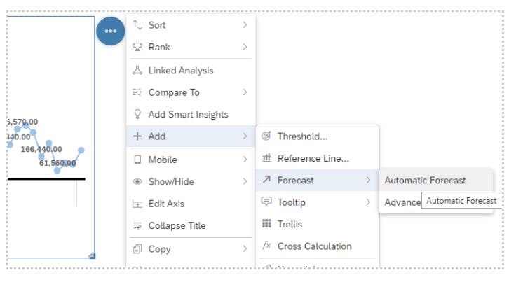
To get started, create a model that includes a date dimension and a measure. Make sure the date dimension is a date type. Next, visualize the data through data exploration or Search to Insight to build a line chart or time series chart. Once the chart is added to the canvas, click on the More Actions menu on the top right of the chart and go to Add -> Forecast. The simplest method is to use Automatic Forecast to get the quickest, most accurate forecast based on the existing data.

There are three options when adding a forecast to a time-based chart: Automatic Forecast, Linear Regression and Triple Exponential Smoothing. The SAP Analytics Cloud Help function defines the forecasting options:
Automatic Forecast: performs a predictive forecast on the available data, allowing the user to specify how many forecast periods to display in the chart.
Linear Regression: predicts future values with historical time series data.
Triple Exponential Smoothing: accounts for seasonal changes and trends.
(There is an excellent blog on the SAP HANA Journey site that takes a deeper dive into the details of each option: Your Guide to Time Series Forecasting in SAP Analytics Cloud – SAP HANA Journey | SAP HANA Journey.)
When you perform a predictive analysis, you will receive a forecast quality rating on the top left corner of the chart. The SAP HANA Journey blog discussed the Mean Absolute Percentage Error (MAPE) value. A MAPE value closer to 0 provides a better prediction rate. Consult the SAP blog for more information.
The question I get most often is “How can I control the number of forecasting periods?” The quick answer to that relates to the amount of historical data available. Organizations that have at least nine periods of past data will receive one period of data in the future. For instance, if data is being forecast monthly and files include data from January through August of 2020, the user will receive one month of prediction. If the historical data contains January through August of 2020, along with all 12 months of data in 2019, the result will be one period for the first nine months of 2019 plus one period for every four months of data. In this example, we will have three months of prediction. The SAP blog mentioned above provides a great description of how this works.
SAP Analytics Cloud is a well-rounded platform that provides a multitude of analytics tools. Without the need for an extensive background in data science, business users can take advantage of complex algorithms to analyze and predict future values. The built-in capabilities of the predictive forecasting feature of a line or time series chart can provide useful insight into the future state of the business. These features are available out of the box with the SAP Analytics Cloud platform and no extra licensing costs are required.
To learn more about our SAP capabilities, contact us or visit Protiviti’s SAP consulting services.


